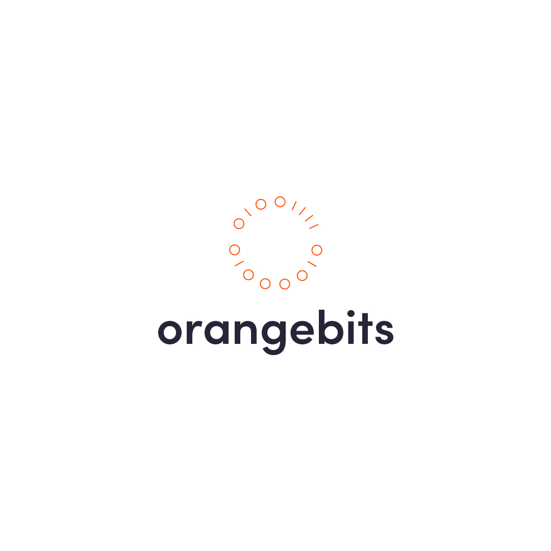
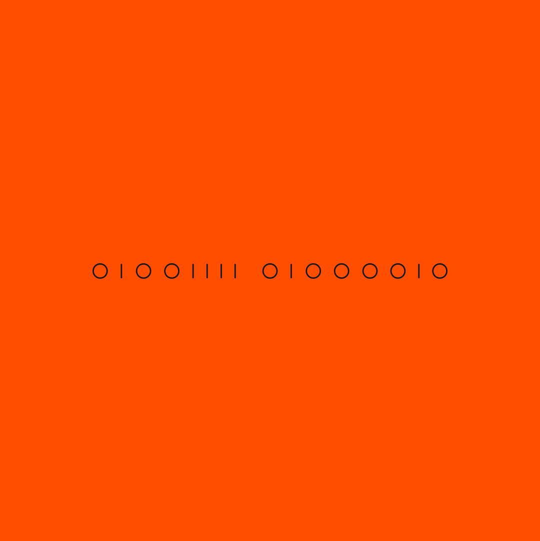
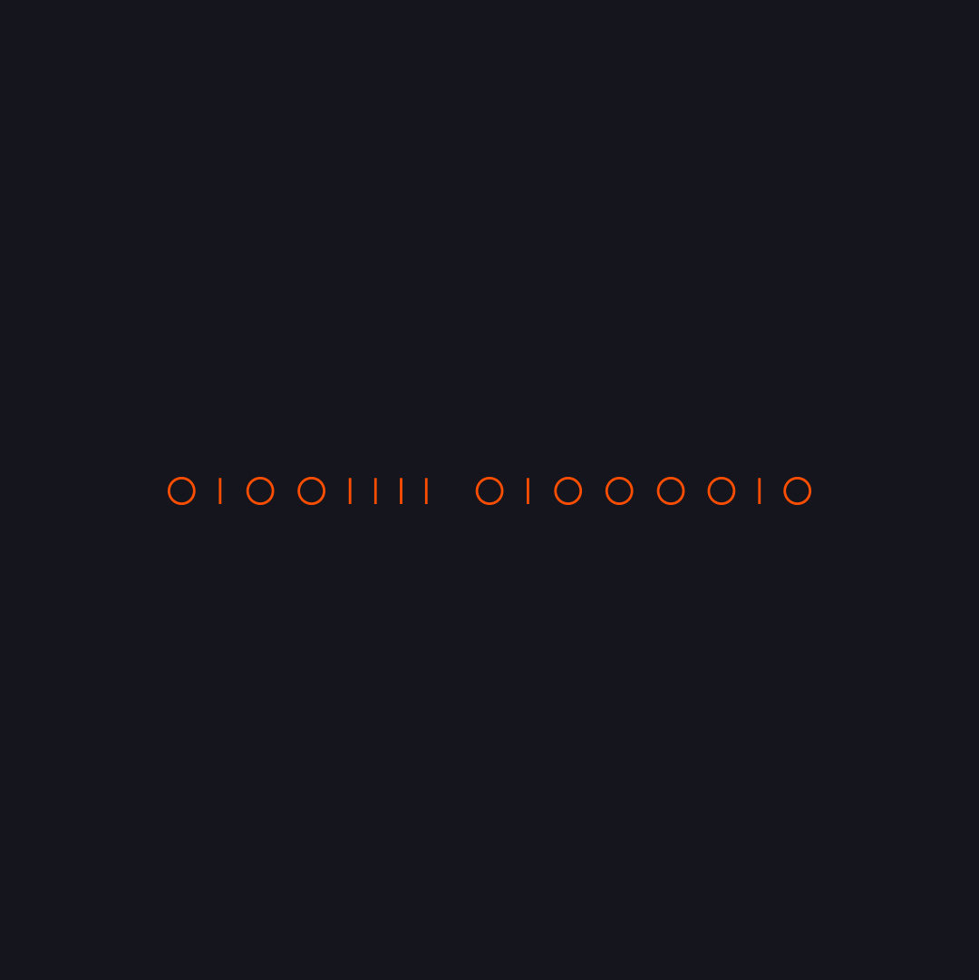
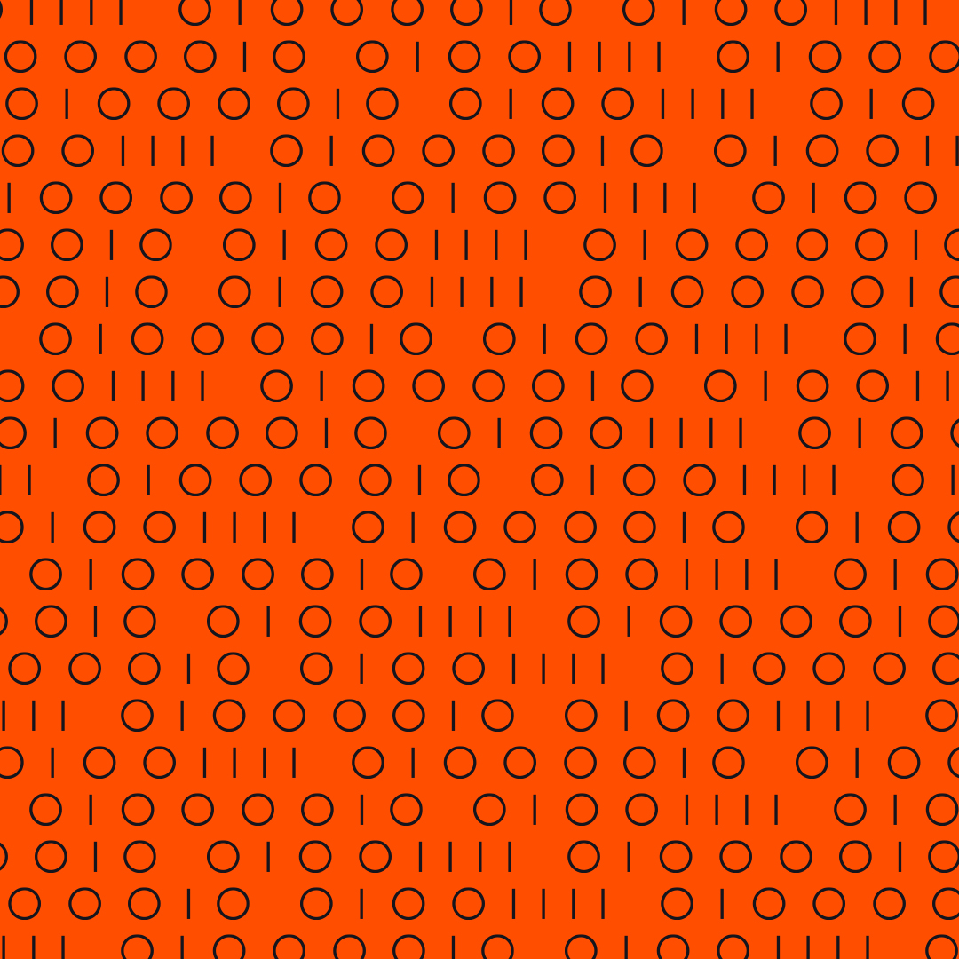
branding
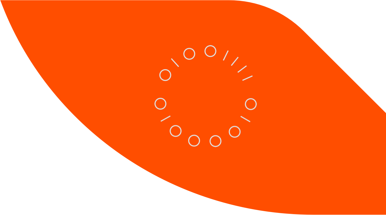
This logo was made for a logo competition. The IT company, called "OrangeBits", was looking for a new and modern logo.
My idea for this logo was to use zeros and ones to illustrate the "bits" part of their name and also to have a link to IT. I transformed the initials (O and B) of their name into bytes (8 bits) and then designed a logo around it. For the logo I've made two variants, one circled logo and one horizontal logo, so they could use the logo in various ways.
In the end they chose a different design as the winner.